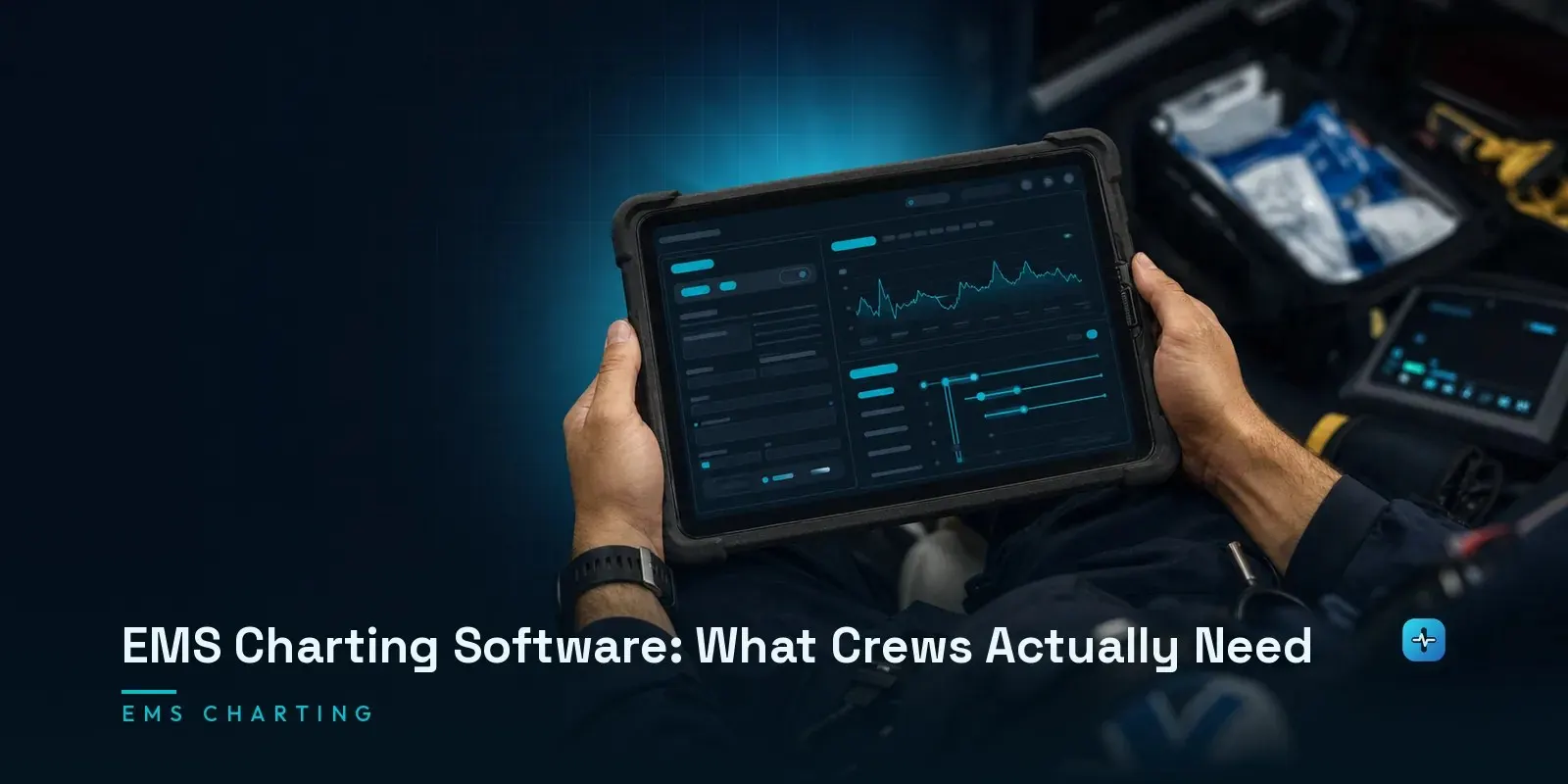
The thing that decides whether EMS charting software works is not its feature list but how it behaves in the back of a moving ambulance with one hand free. Crews document during transport, often with gloves on, sometimes in daylight that washes out a screen, and routinely in places with no signal — so the measures that matter are how many taps a routine chart takes, whether the application keeps working when connectivity disappears mid-call, and how quickly a narrative can be entered without fighting the interface. A system that scores well in a conference-room demo can still fail all three. The practical test is to hand tablets to actual field providers, give every vendor the same realistic scenarios including a deliberate dead-zone, and time them — because completion time under realistic conditions separates products in a way that a feature comparison never does.
Why Feature Lists Don’t Separate These Products
Vendors write for the chief who signs the contract. Almost nobody writes for the medic actually using the software at 3am, cold hands, in a moving ambulance — and that gap is exactly why feature comparisons across ePCR platforms tend to look nearly identical while the real field experience varies enormously. Field usability isn’t a nice-to-have layered on top of NEMSIS conformance; it’s a co-equal requirement, and evaluations that skip it are evaluating the wrong half of the product.
Offline Behaviour Is the First Test
Connectivity loss mid-call isn’t the exception in EMS field work — it’s the routine operating condition, which is the same point I make about ePCR architecture generally in the pillar post. What actually separates products here: does the interface make an unsynced report visibly obvious to the crew, or does it look identical to a synced one until someone checks later? Does sync conflict resolution, once connectivity returns, handle a partially-completed record gracefully or silently drop data? These are testable, specific questions — ask a vendor to demonstrate the exact behavior, not just claim “offline mode.”
Taps Per Chart
This is a clinical safety issue dressed up as a convenience metric, and it’s worth treating it that way. Every additional tap a routine chart requires is time a crew isn’t spending on the patient, or time spent after the call trying to reconstruct details from memory instead of documenting them in the moment. Time a real, routine call’s full documentation flow across candidate products before deciding — the number of taps for the same clinical content is a genuinely comparable, objective measure.
Documenting While Moving
Real, physical usability constraints that a conference-room demo doesn’t test: gloved-hand touch accuracy, screen visibility in direct sunlight, one-handed operation while the other hand is occupied with patient care, and multi-crew documentation when more than one provider is charting the same incident from different devices. Each of these is testable with the actual hardware your crews will use, in actual field conditions — not a vendor’s polished demo environment.
Narrative Entry
Voice-to-text, structured templates that generate narrative text, and free-text entry all trade off speed against structure differently, and the right balance depends on your crews’ actual documentation habits. One caution worth stating plainly if AI-assisted narrative generation is part of what you’re evaluating: ask specifically what data the feature uses to generate text and where that data goes, processed on-device or sent to a third-party service — a genuinely reasonable question given the PHI involved, and one worth getting a clear answer to before adopting the feature, not after.
What the Vendors Are (Honestly)
ImageTrend, ESO, ZOLL and First Due are the names that come up most, and each has a genuinely different profile rather than a simple better-or-worse ranking — I go through ImageTrend and ESO individually in a dedicated post and another, and the full head-to-head comparison lives in our three-way ePCR comparison.
How to Actually Test It
The single most useful thing an agency can do before signing a contract: hand tablets to actual field providers, not administrators, and run every candidate vendor through the same realistic scenarios — including a deliberate dead-zone simulation. Score on completion time and crew feedback, not a feature checklist. This is the one evaluation step that most agencies skip and that actually predicts real-world satisfaction better than anything in a sales deck.
Next Steps
Your crews’ complaints about a current system are a buying signal worth taking seriously, not friction to route around. If you’re evaluating ePCR platforms and want an independent technical read on field usability claims, or you’re scoping a custom build where field usability is a first-class design requirement from day one, talk to our team.